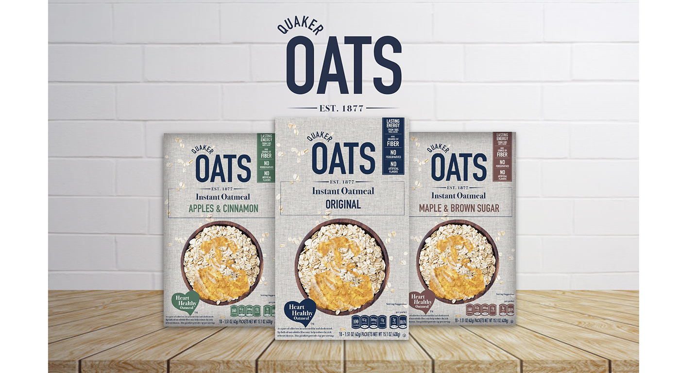
The well known brand, Quaker Oats, has been around for years targeting adults to promote heart healthy oatmeal. Quaker Oats as a brand has an easily recognizable logo that has represented their products for years.
I felt as if it was time to update the look and fell that you get from this iconic brand. Instead of the old time, 1800's look, I wanted to create a more modern, simplistic look. I tried to be as clean and minimal with the design and colors as I could. I did incorporate the iconic man from the original logo considering that is something that has help to get this brand where it is today, while sticking with the simplistic energy.


